Personal Account Migration
We cut our dependency on a third-party account service by migrating off Kwiga and into a custom Webflow + Memberstack setup - reducing support tickets by 65% and enabling analytics plus UGC Library monetisation options.
My role
Timeline
Impact
Solo Product Designer
6 months (H2 2024)
-65% Support Tickets
Problem & Context
The Instapreneurs is a subscription-based learning platform for junior-to-mid marketing and SMM professionals. Learners were bouncing between our branded site and Kwiga's third-party interface, leading to:
- Jarring context switches that confused users
- Playback errors and unclear cancellation flows spurring support tickets
- Zero insight into content usage or upsell potential
Objectives
- Unify all account flows in our own branded UI
- Reduce support tickets by clarifying navigation and subscription status
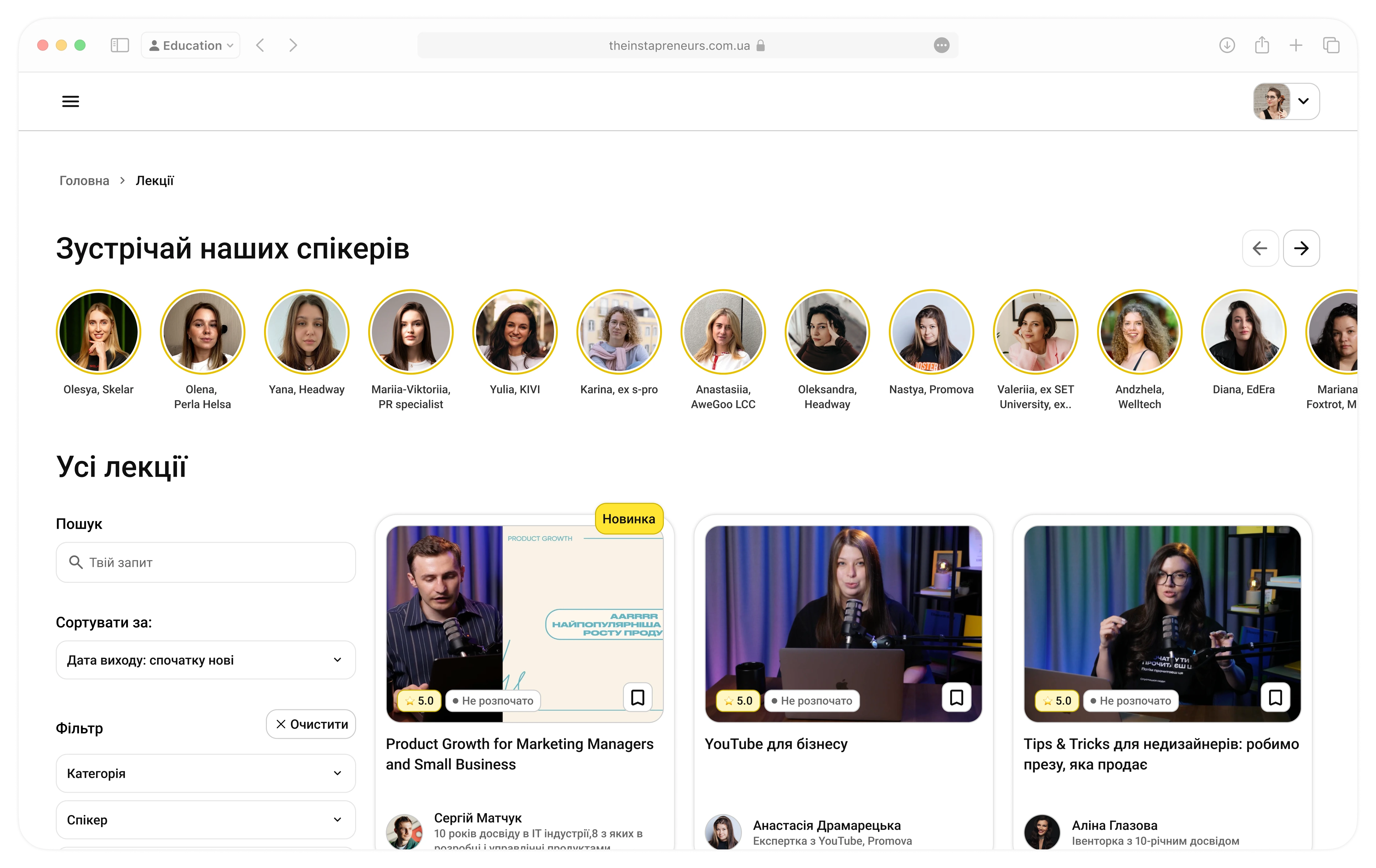
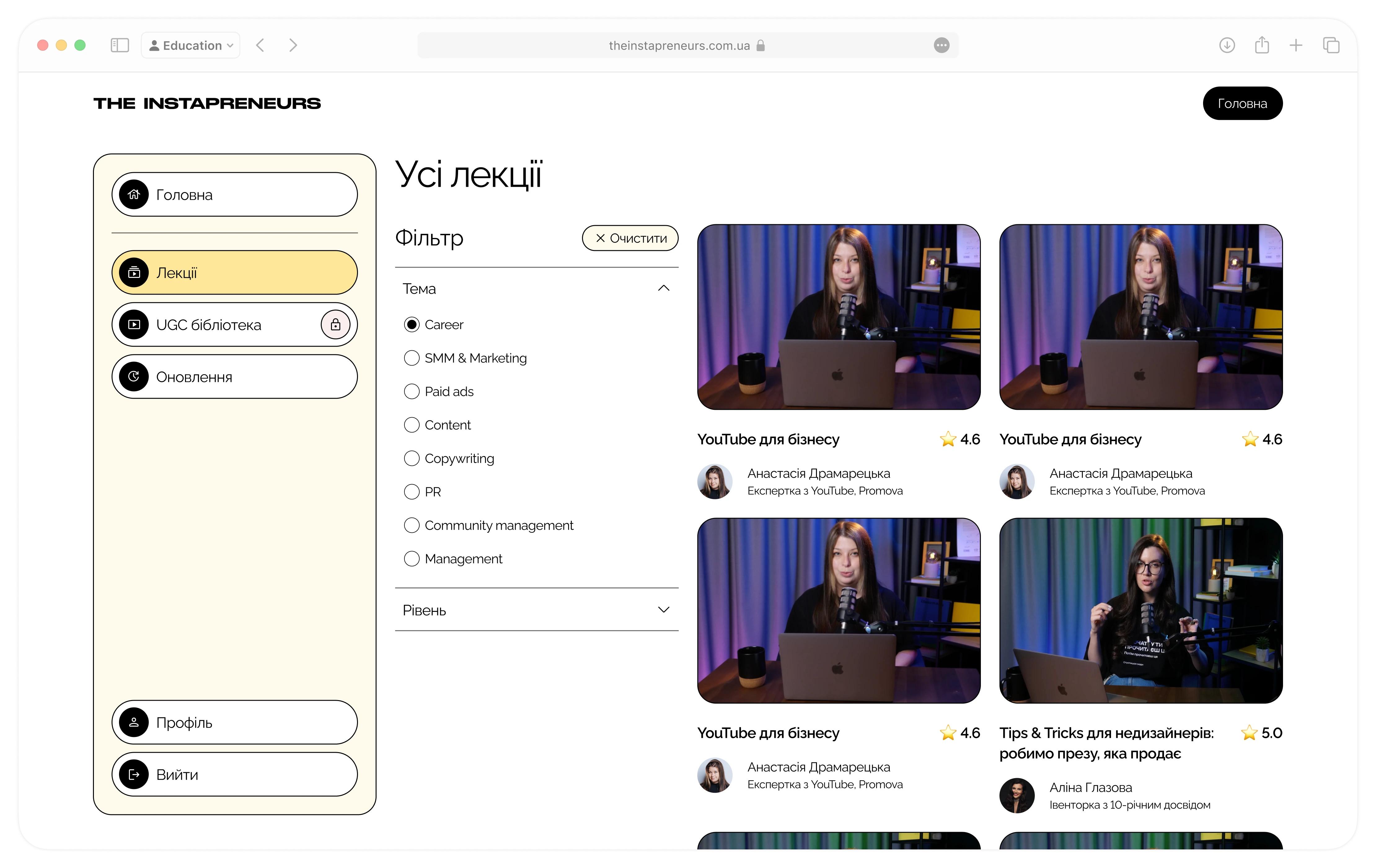
- Boost discovery with search, filters, and bite-size lectures
- Enable more analytics for personalisation and A/B tests
- Scale & Monetise the UGC Library through in-app upsells and easy content discovery
My role
As the sole Product Designer, I owned the project from end to end: stakeholder interviews, IA mapping, sketching, high-fidelity Figma designs, design-system foundation and dev hand-off.
Research & Key Insights
First, I needed to understand what users need and want from the personal account, the limitations of our current Kwiga setup as well as the technical constraints of our no-code stack (Webflow plus third-party tools like Memberstack). My plan was to talk to stakeholders to figure out real pain points and feasibility.
I interviewed:
- Veronika (Founder) to align on business goals
- Viktoriia (PM) who managed Kwiga day-to-day
- Oleksandra (Support Manager) for user reports and support tickets
- Oleh (Developer) to map out technical possibilities
Key insights
- 30% drop-off at the site-to-Kwiga transition
- 65% of support tickets tied to playback, pricing, or cancellations
- User requests for a range of features such as bookmarking, progress tracking and personalised recommendations
- Content discovery was challenging in the existing interface, making it hard for users to find relevant lectures
- Limited analytics from Kwiga revealed only basic playback data, limiting our ability to personalise the experience
- Technical audit with our developer uncovered a cost-effective migration path that would enable full analytics and in-app upsell slots
Design Process
We split the migration into three clear phases - initial MVP, refinement, and final polished version - so you can see both the big picture and the details that got us there.
Initial MVP
Goal: Ship the simplest usable account experience to validate core flows and start the migration of users.
What I did:
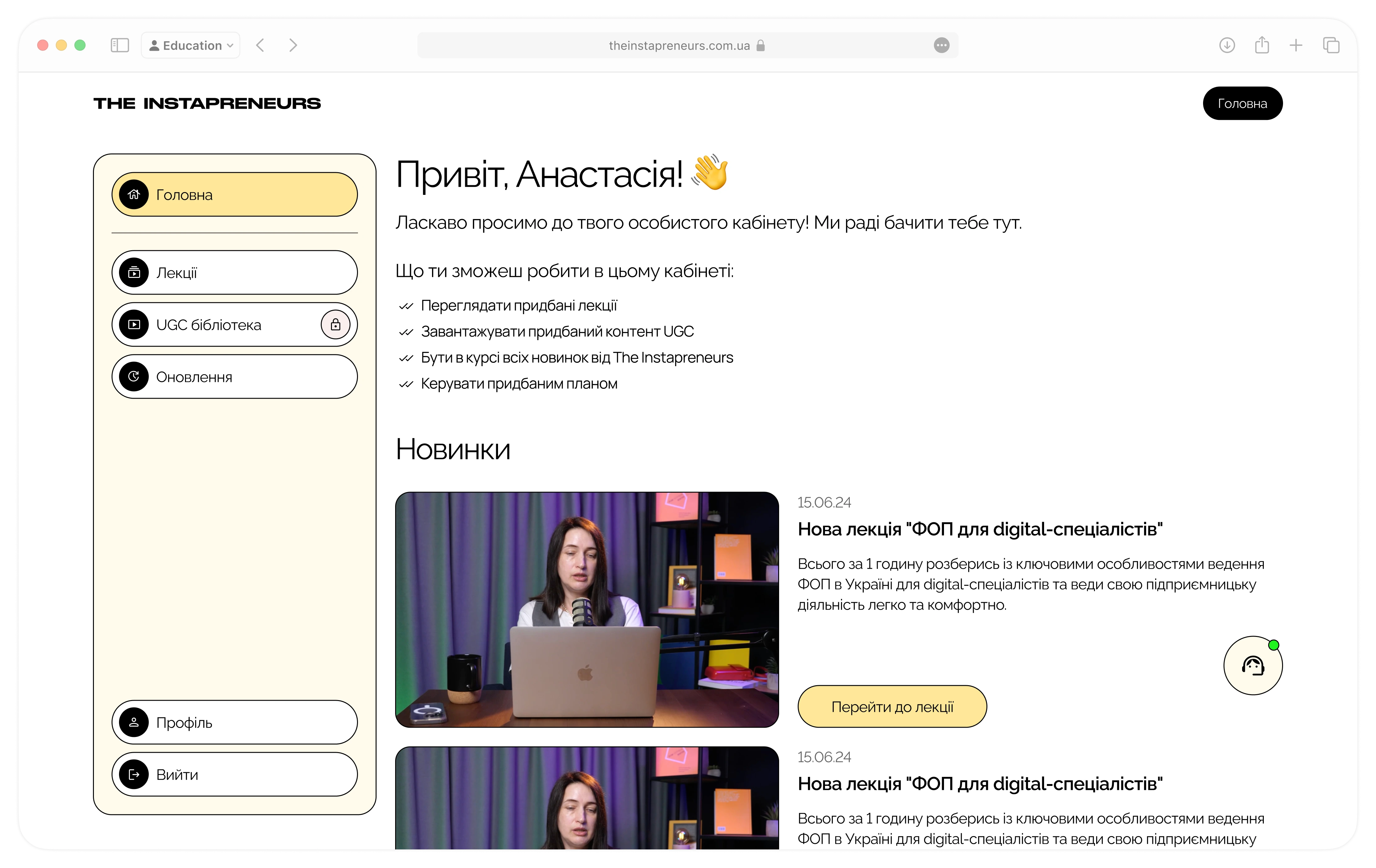
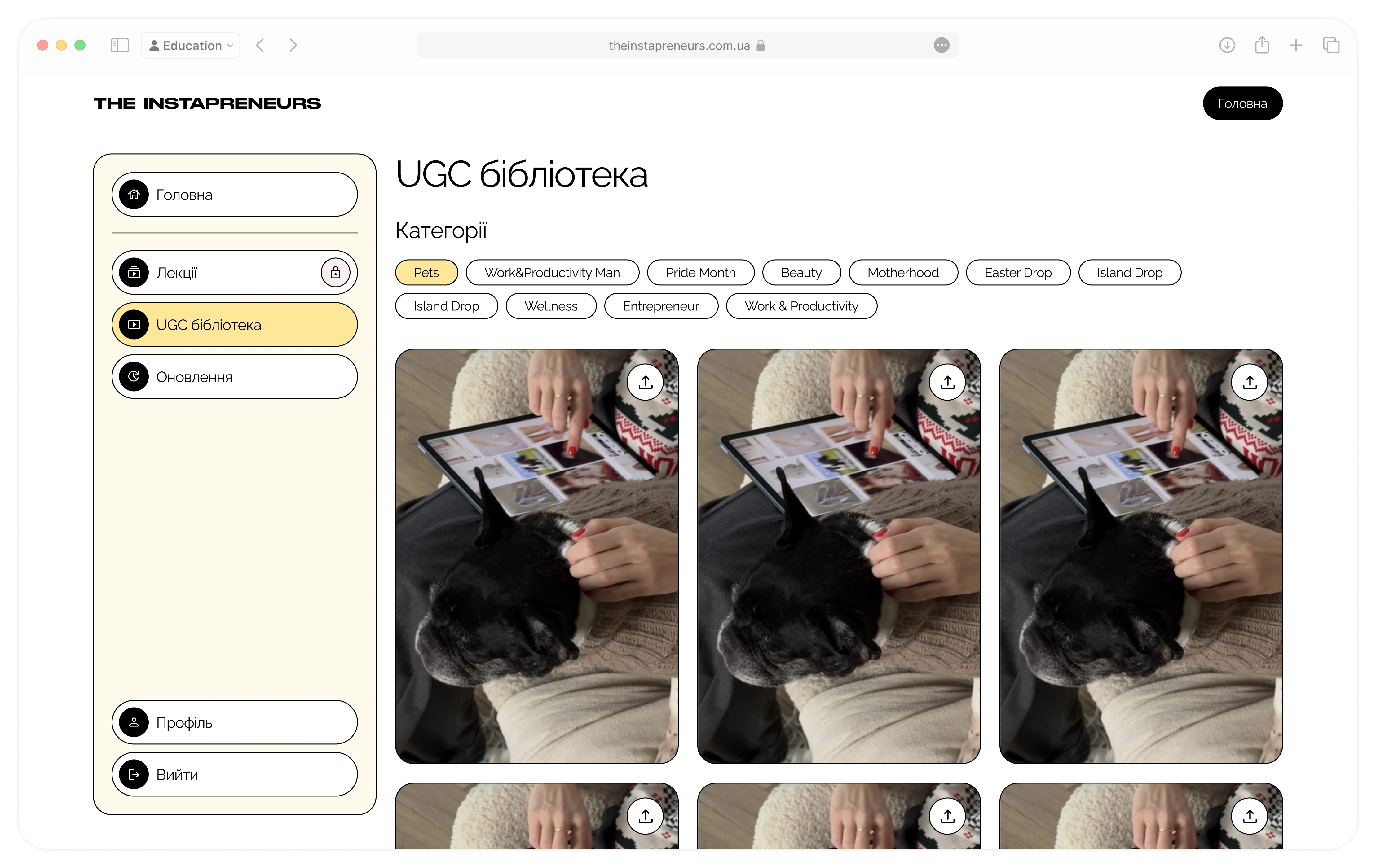
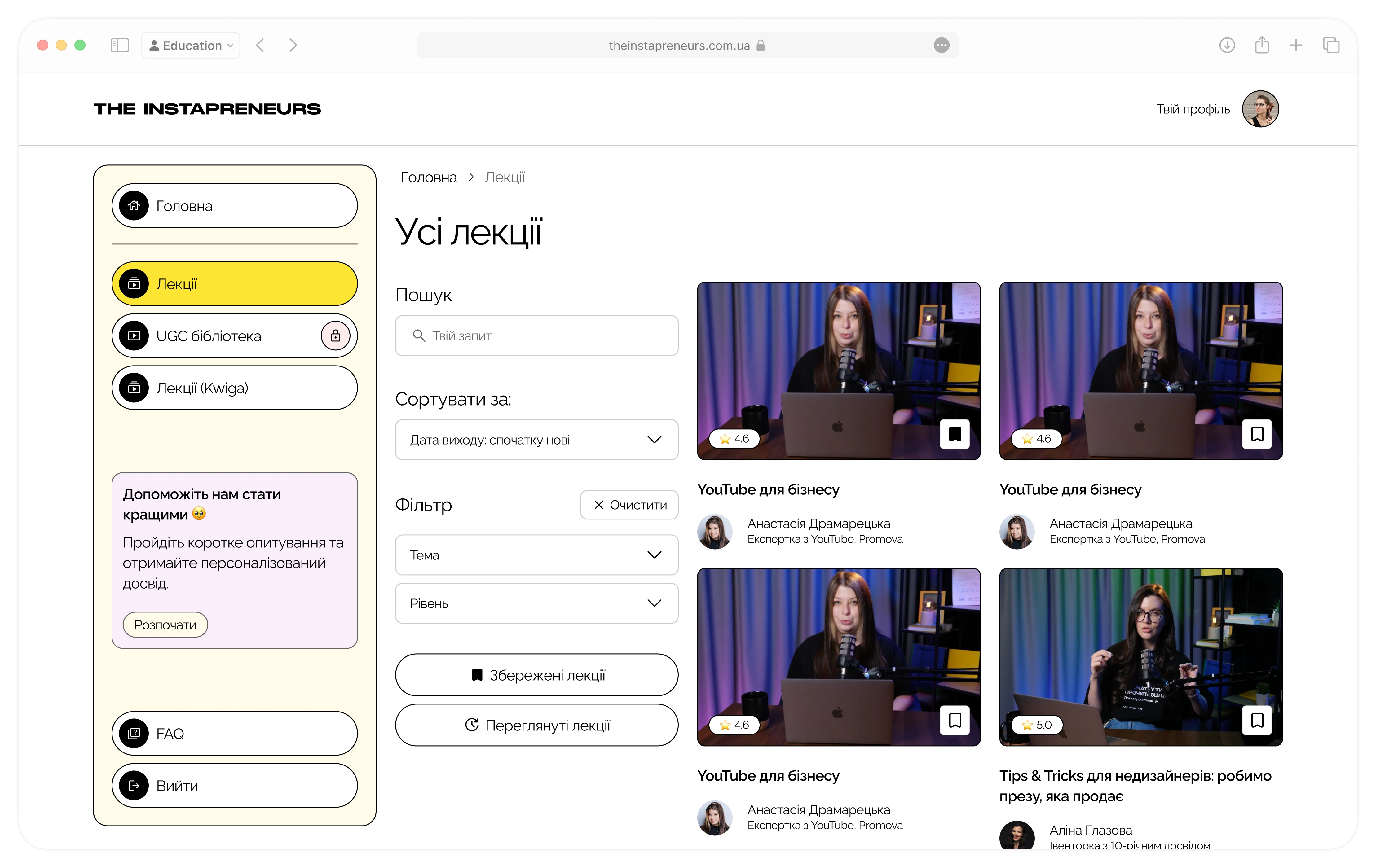
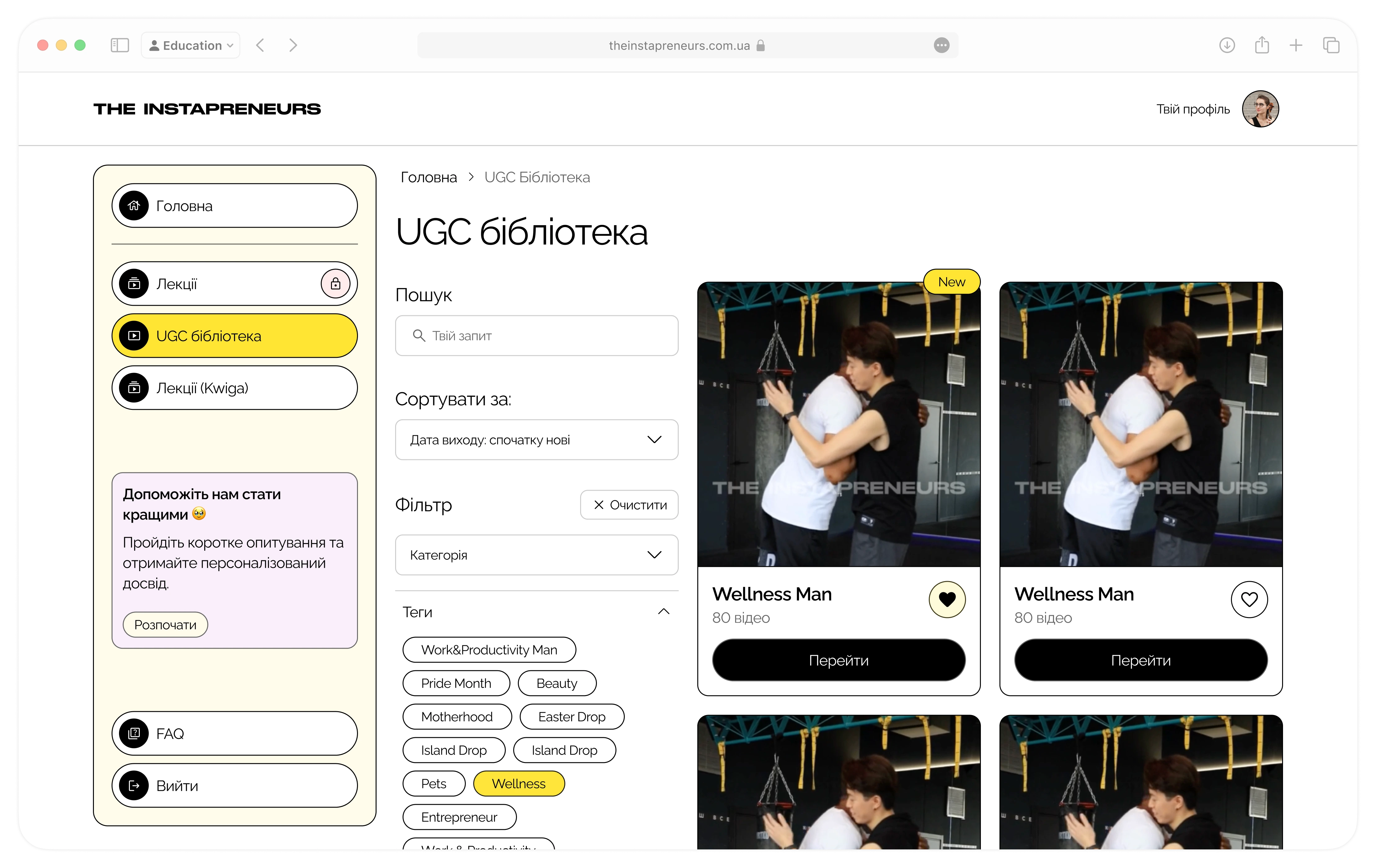
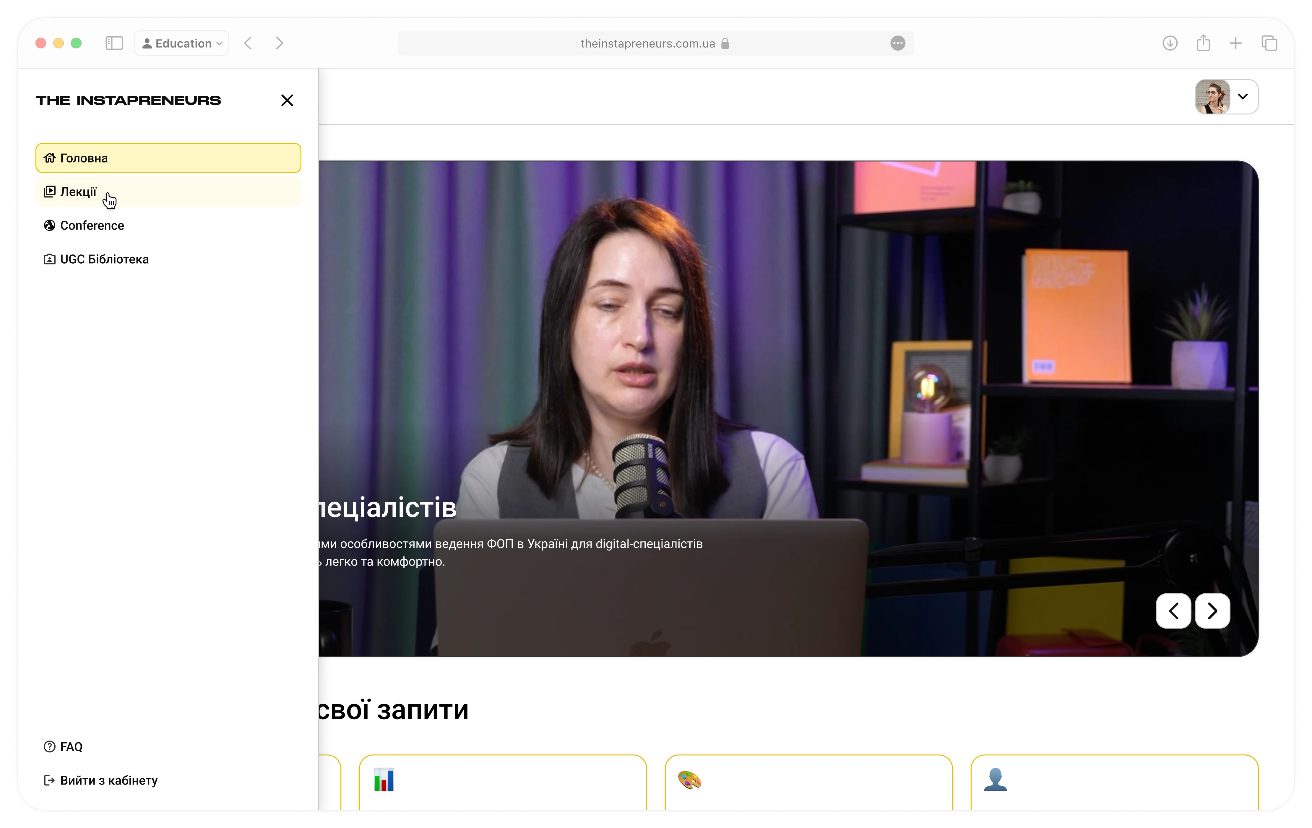
- Built a unified sidebar (Home · Lectures · UGC Library · Updates · Profile)
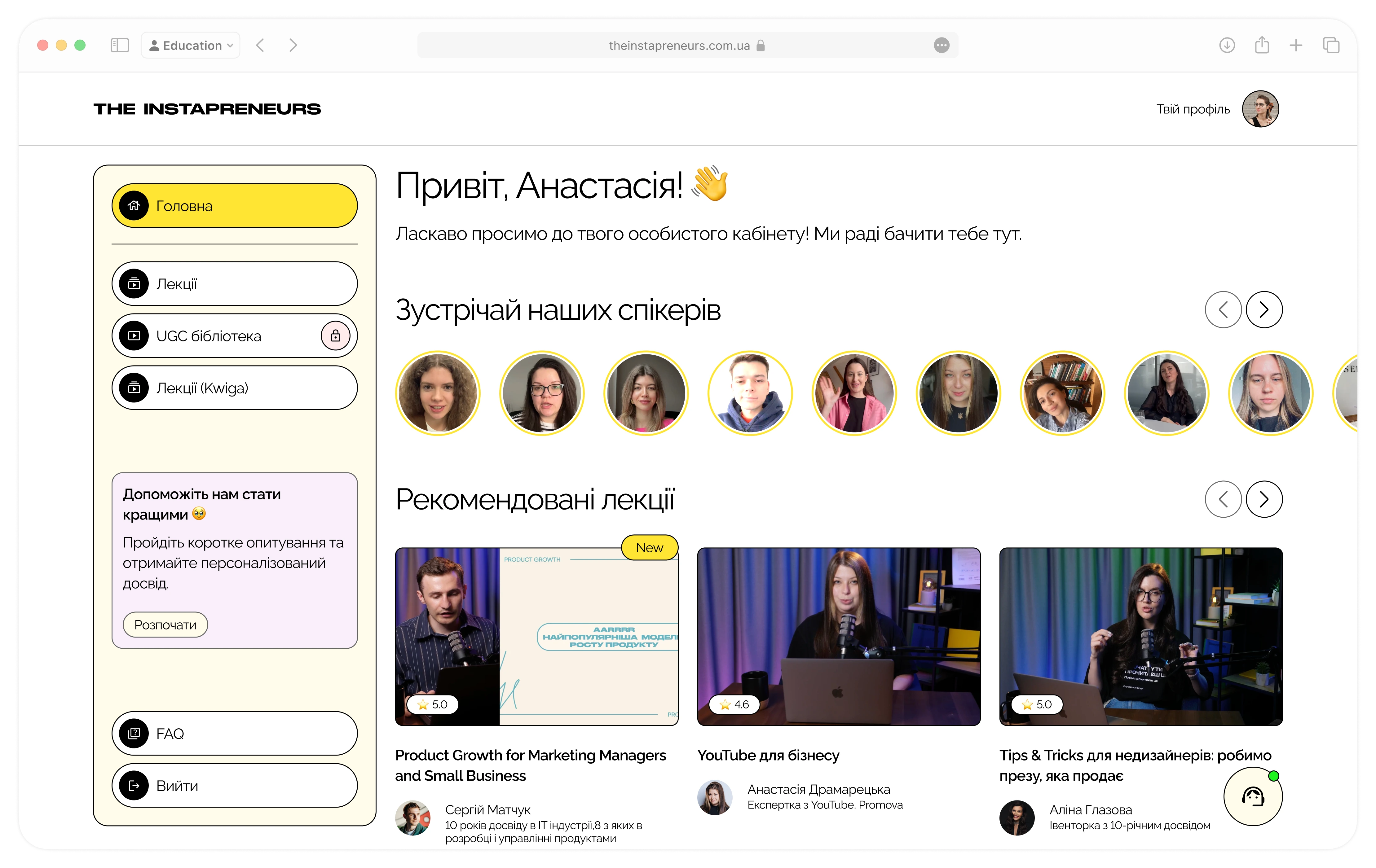
- Designed a personalised dashboard greeting and quick-action tiles to products
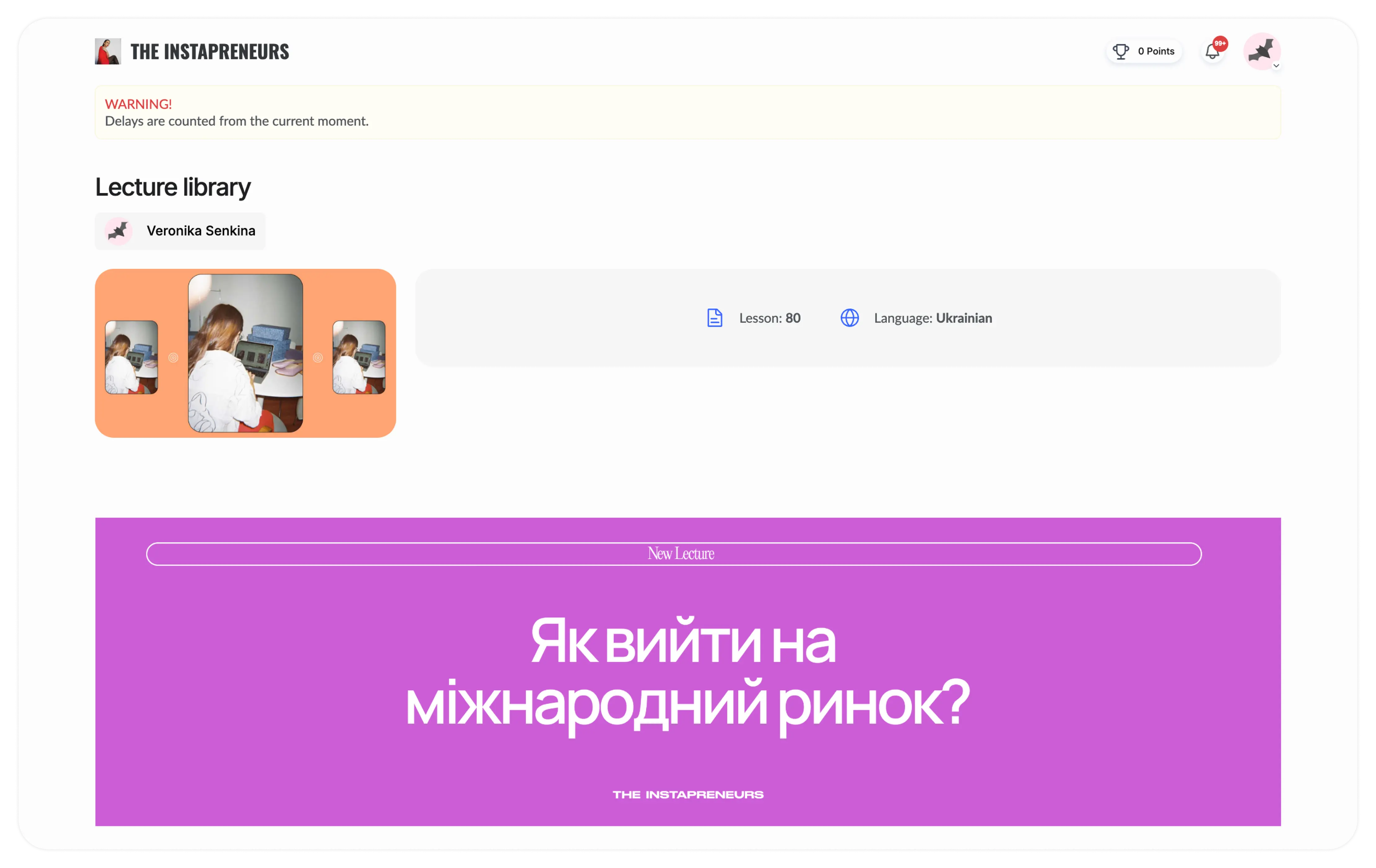
- Implemented the first “Updates” tab for new content alerts and technical updates
Refinement
Goal: Smooth the transition for existing users and implement key feedback.
What I did:
- Added “Lectures (Kwiga)” legacy link for users that still have access to Kwiga (we were transitioning them offering discounts)
- Embedded an in-menu survey to gather migration feedback
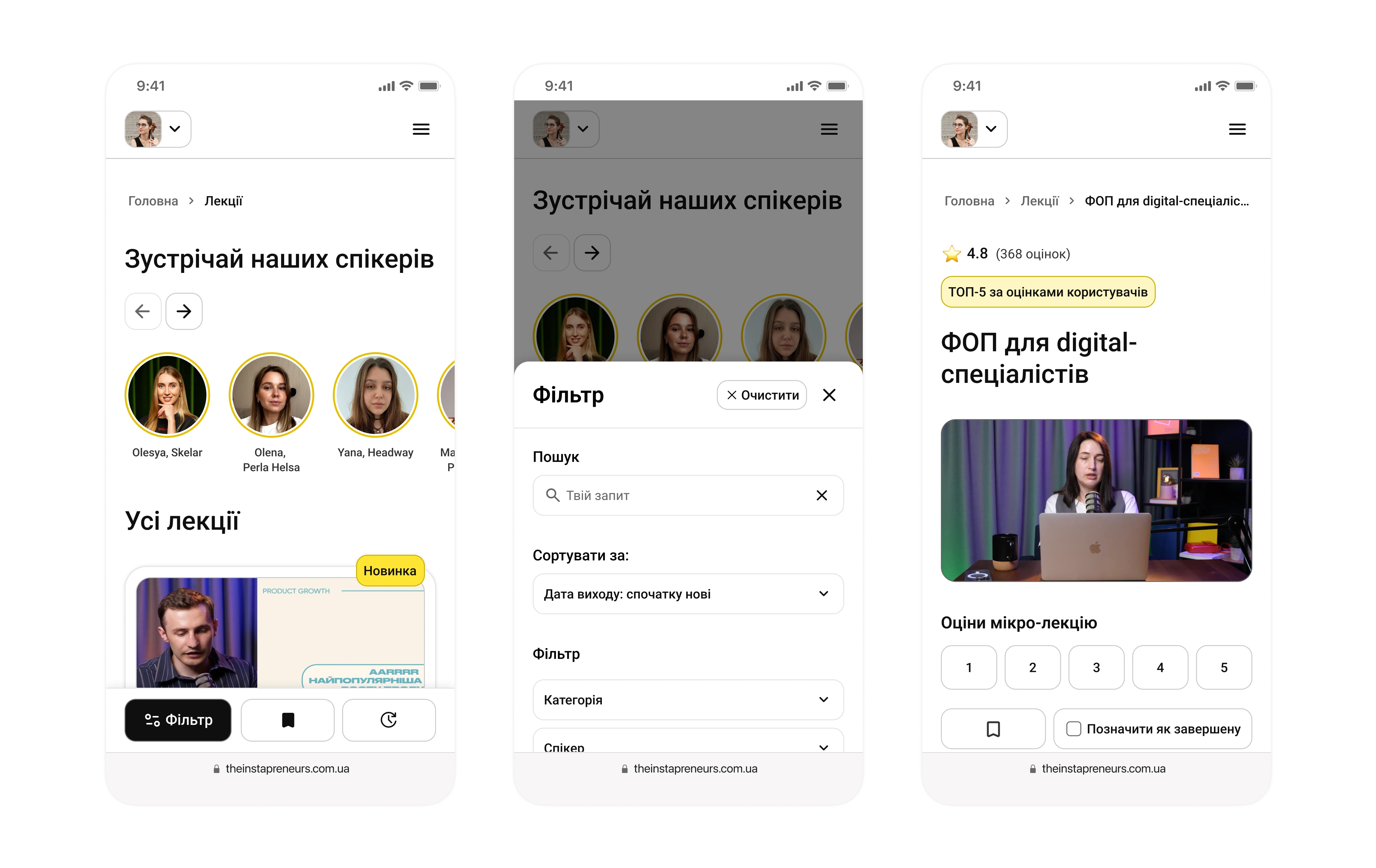
- Swapped “Updates” for a “Recommended Lectures” carousel to make the content more discoverable
Final
Goal: Lock in a cohesive design system, streamline content discovery and improve the layout.
What I did:
- Established colour, typography, and component tokens in our Design System that unified all our main products
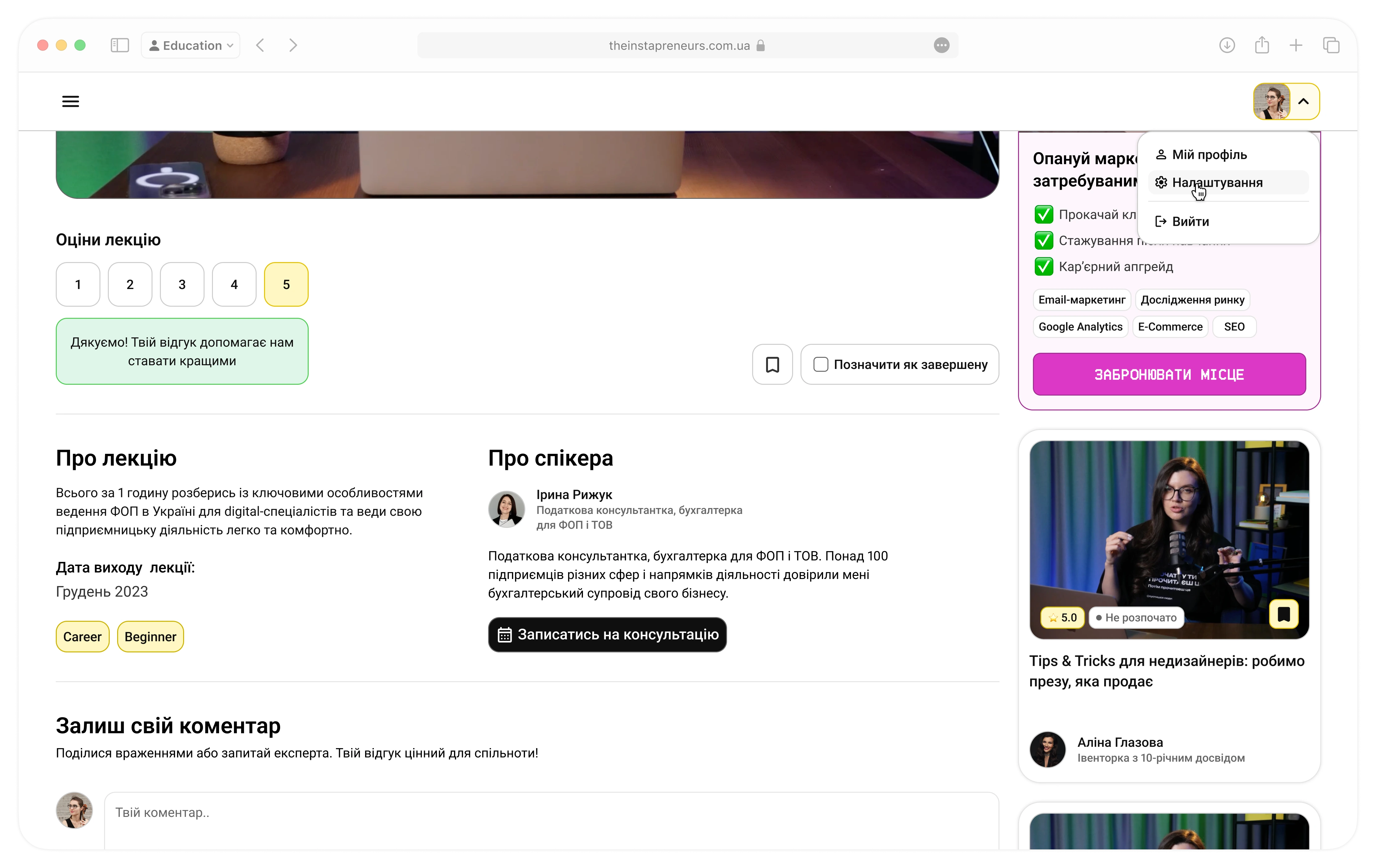
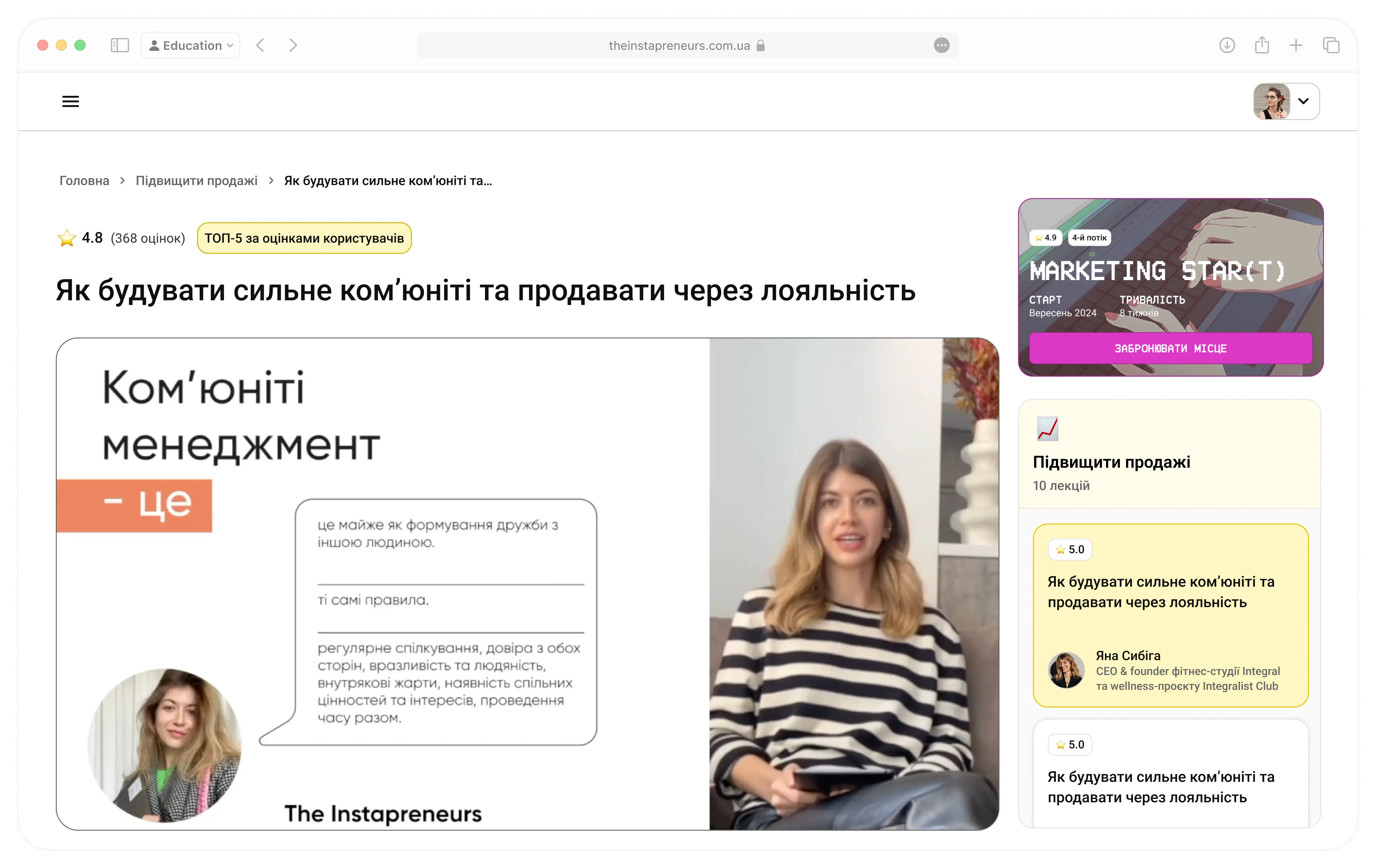
- Introduced contextual upsell banners on Home and Lecture pages
- Added a “Meet our Speakers” carousel with booking links
Outcome
Owning our personal-account UX end-to-end led to a 65% drop in support tickets, 40% higher onboarding completion, and 50% more UGC engagement as well as gave us richer data on user needs - - all on a foundation built to scale.
Key takeaways:
- Ship an MVP, gather real feedback, then iterate
- Partner closely with PM, support, and dev for faster wins
- Invest early in a design system for consistency and speed
- Run small experiments to unlock big gains
“Migrating our account flows was just the start—it gave us a repeatable, user-centered framework for growth.”
Next Case